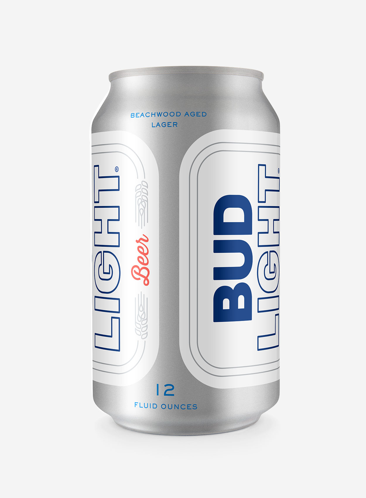
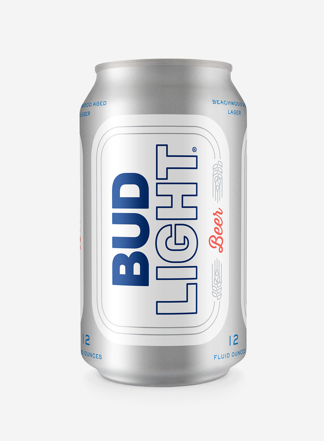
 Bud Light rebrand (proposal)
—
Bud Light was once the King of Beers, but time had finally caught up to the brand and other beer brands were sharing the crown. As a part of the 2016 Bud Light pitch, Wieden+Kennedy was asked to update the look of the Bud Light packaging.
A top selling beer brand with no real authentic brand assets, Bud Light looked more like a soda company than a beer company. The updated logo and packaging introduced beer language in a modern yet timeless way. The packaging created a play-on-words depending on how the viewer saw the packaging, reading either “Bud Light beer” or “Light beer, BUD”.
Role: Senior Designer @ Wieden+Kennedy


